The World in 2100
Inspiration
Around this time last year, I listened to a presentation given by a Washington Post graphics reporter who shared many pieces of wisdom, one that stuck with me was “don’t be a snob, sometimes Excel is the best tool.”
I didn’t think to ask if she meant for data manipulation, data visualization, or doing your taxes.
In any case I decided that for this post I would do a complete 180 from my most recent posts and shamelessly (re)create an infographic using only Excel.
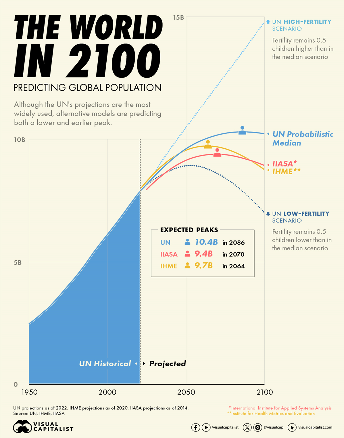
My inspiration was a graphic from the Visual Capitalist which caught my eye, it seems to be popular as I’ve seen this graphic recreated twice in two of my LinkedIn connections portfolios.
Compared to the tools I’ve been using lately (Power BI and Vega) Excel is vastly more flexible and quicker at producing basic charts. While I really like this graphic, it is fairly basic, and I suspect the original was made in Excel and dressed up in Adobe Illustrator.
I wanted to see how close I could get to this published graphic relying only on Excel charts, text boxes, and shapes, and how quickly I could do it.
To make things a little more fun I used an incomplete dataset which I interpolated (because I shamelessly pulled the data from fellow Vega enthusiast Imran Haq’s Power BI recreation.)
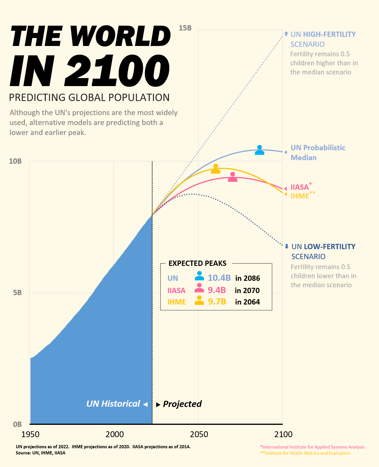
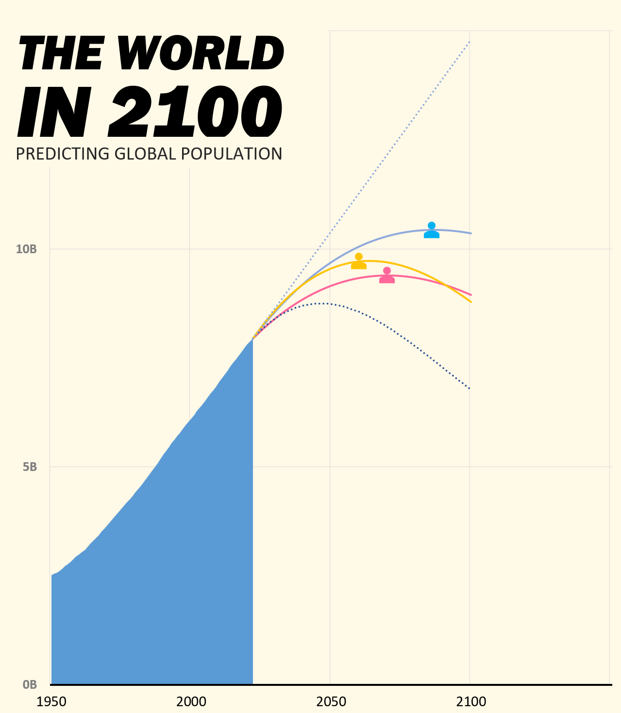
The graphic
The process
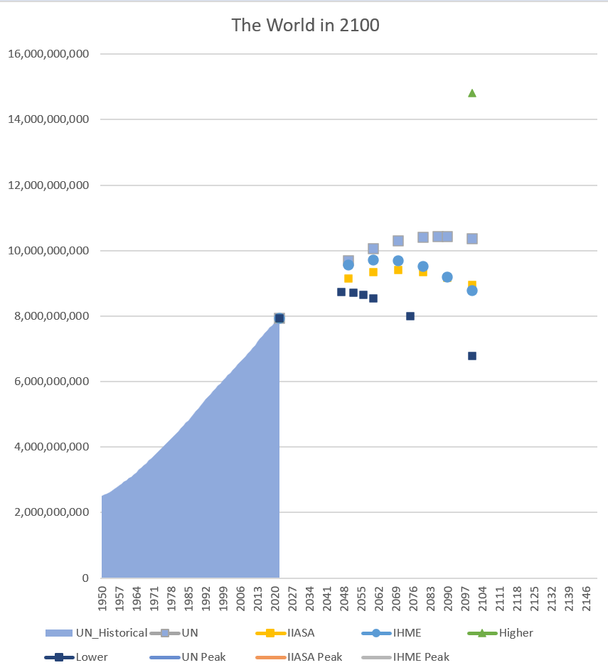
When I say Excel chart you probably think of something like this right?
This is where I actually started after I combined historical data and point estimates from the UN, IIASA, and IHME.
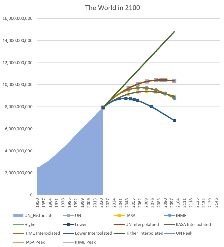
I fit a quartic function to each series of point estimates using an array function:
And brought these functions into the data table to bridge the gap between historical data and the point estimates. If you open the Excel file, note that this table extends to 2149. This is in order to create more space on the canvas later.
Here I am making sure my polynomials have a good fit and the lines actually go through the point estimates:
Now we can start to make this look nice.
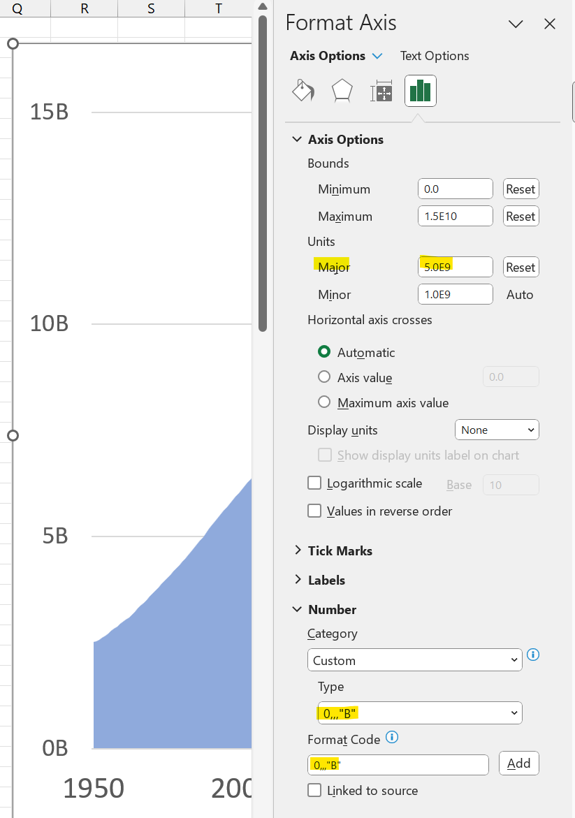
Updating the y axis labels to billions by using a custom format code and increasing the major interval unit for both axes, no need to modify the source data. I also increased the font sizes:
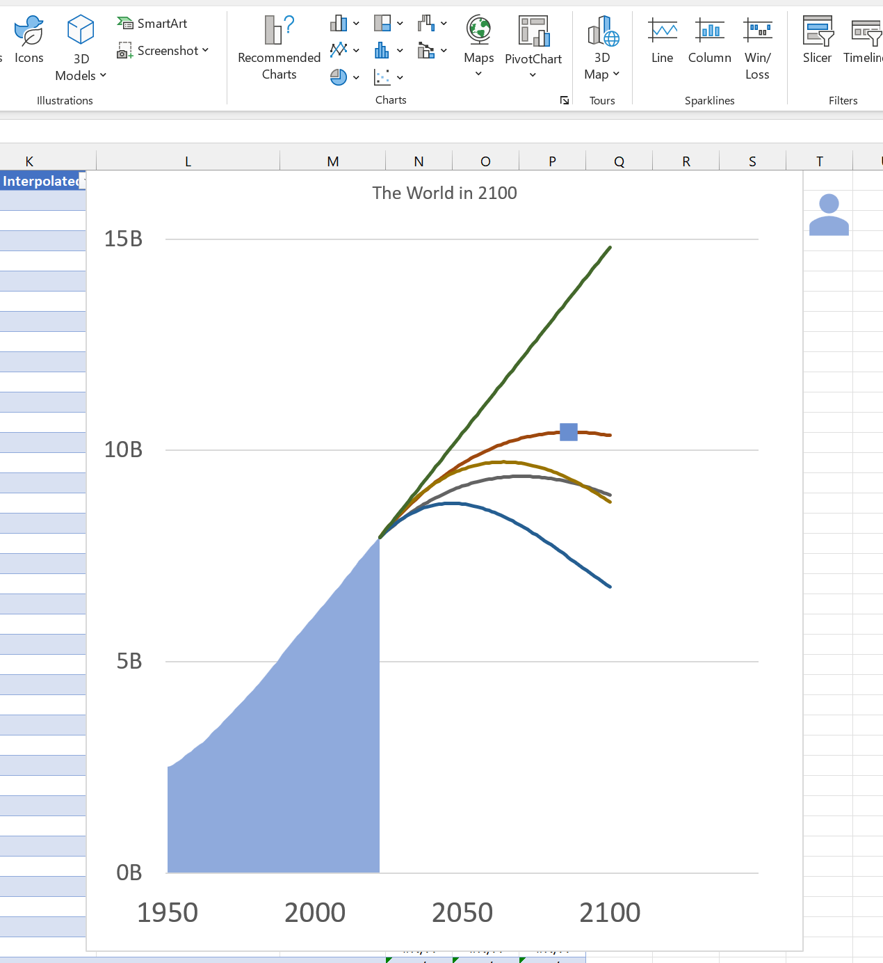
To create the person markers on the lines, I added a formula to the table to indicate whether or not the current row is the max. While unsightly, the #N/As will ensure that there is only one point plotted on the graph for this column:
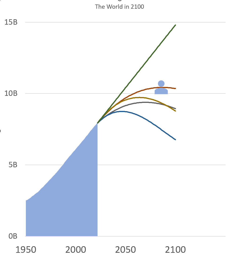
Now after adding a marker to the page it can be replaced with an Excel icon, by copying the marker, selecting the icon and pasting:
If the data were to update this person would now move along with it:
After this point, I added the other markers, updated the line and background colors, and added a better looking title.
Everything after this point is either a text box or a shape either adding information or arranged to hide something (like parts of the gridlines).
The download
Here is the Excel file if you feel interested at all to check it out!

