(Making of) An Interactive History and Demographic Analysis of Costco
Introduction
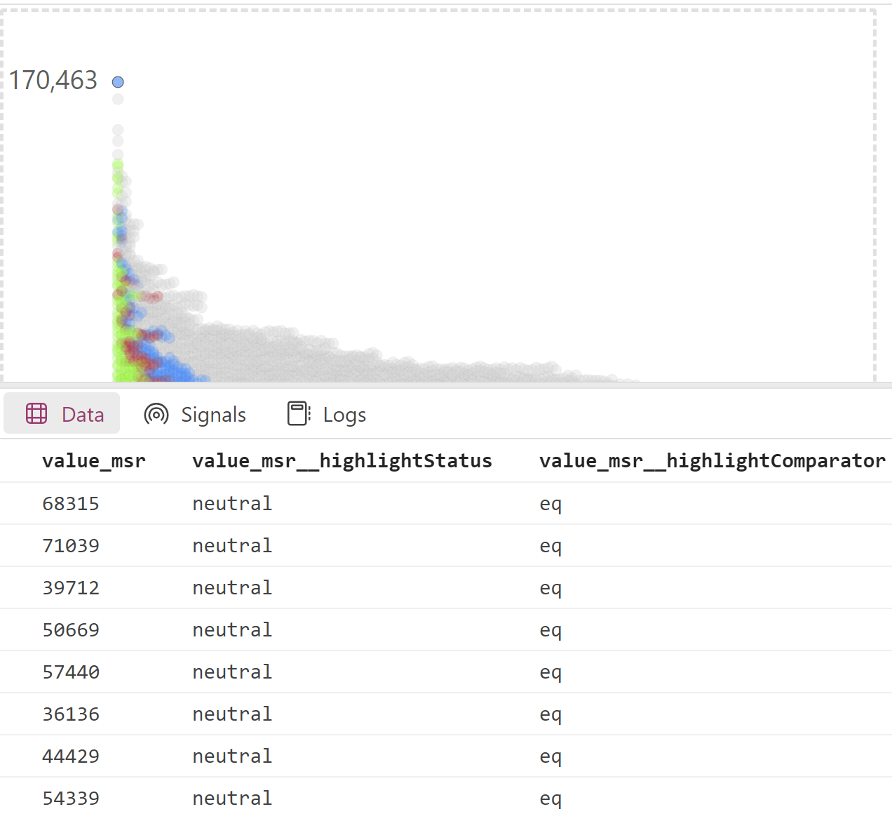
The right tool should be used for the job. When I started working on my Costco article and visual demographic analysis, I knew that Power BI and Vega would not be the best choice for what I wanted to do which was create a fully interactive scrollable infographic. The demographic analysis page alone displays somewhere around 16,000 selectable data points and attempting to have everything on a single page simply overloaded Power BI.
This project was very experimental and I really didn’t know how well everything would work out when I first started. If I could go back would I do it in Power BI again? Yes, but only because of everything I’ve learned. I feel like I leveled up my visualization skills 5 times while working on this project, I also learned a few new things in Power BI.
My personal Power BI Pro license is costing me $10 a month though which I need to publish the report to web, a small sum, but if I had produced this 100% in Vega and html/css while hosting the data on github I’d pay nothing out of pocket. Alternately if I had used Tableau public, I’d also be paying nothing out of pocket, though I am not sure everything I’ve done can be accomplished in Tableau. Microsoft should really offer something similar to Tableau public.
I could probably write a book about everything I’ve learned about Vega, Power BI, and Costco over the last 4 months. This article will touch on the creation of the key visuals and a few Power Bi techniques used in my Costco article and visual demographic analysis.
Interactive globe
I have previously written about my inspiration to create this visualization which was a graphic from the Economist:
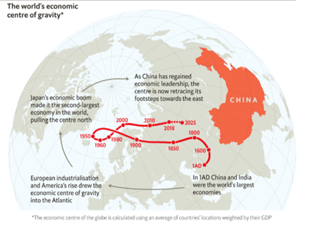
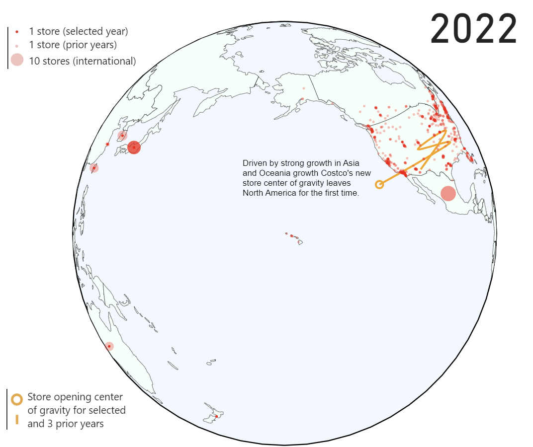
I hypothesized that given Costco’s international growth in Asia and Europe the center of gravity of all stores would move off the North American continent sometime in the 2010s. Disappointingly it never does! I really wanted to do something similar to the Economist so I adjusted my strategy to show the center of gravity of new stores only and a trail of the prior three years. Unfortunately this too resulted in a line that only leaves the United States twice. With a graphic focused on the world I feel that seeing a line bounce around the US for almost 50 years isn’t the most interesting thing, but given the sunk cost of nights and weekend I worked on this I decided to leave it in. Everything in this report is defined with easily updatable data pipelines so perhaps in a few years I’ll get my wish for a line that traverses more countries.
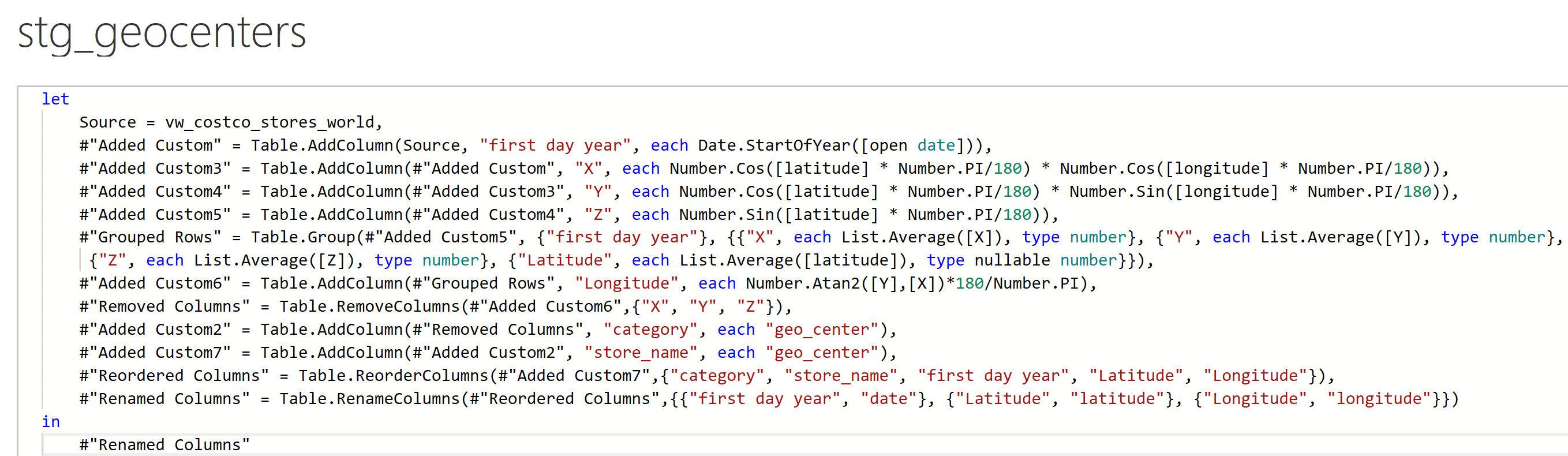
Calculating the geocenters using world store data:
Two challenges I faced in producing this globe were
- Forcing the globe to autorotate to predefined points of interest
- Store symbols being visible through the other side of the map
I was very dedicated to the idea of keeping this graphic as a globe rather than a world map, I simply like the aesthetic more, one issue that I ran into though was that for example when Costco’s first European location opens I wanted the map to display Europe automatically. As it turns out this was no easy feat. I thought simply creating a table with predefined rotation parameters and passing those as signals would work. Doing this caused a circular logic error in Vega however; creating a map projection with data from the dataset and plotting that data on the map just doesn’t work. After trying one hundred things that didn’t work I figured out how to use an event to update the map rotation after creating the map. The event in this case is based on a timer. One millisecond after producing the map, the rotation is updated from my dataset.

The other challenge I faced in creating this map was that store locations were visible on the other side of the world when rotating the map.
An example of North American stores appearing in the North Pole when rotating the map: 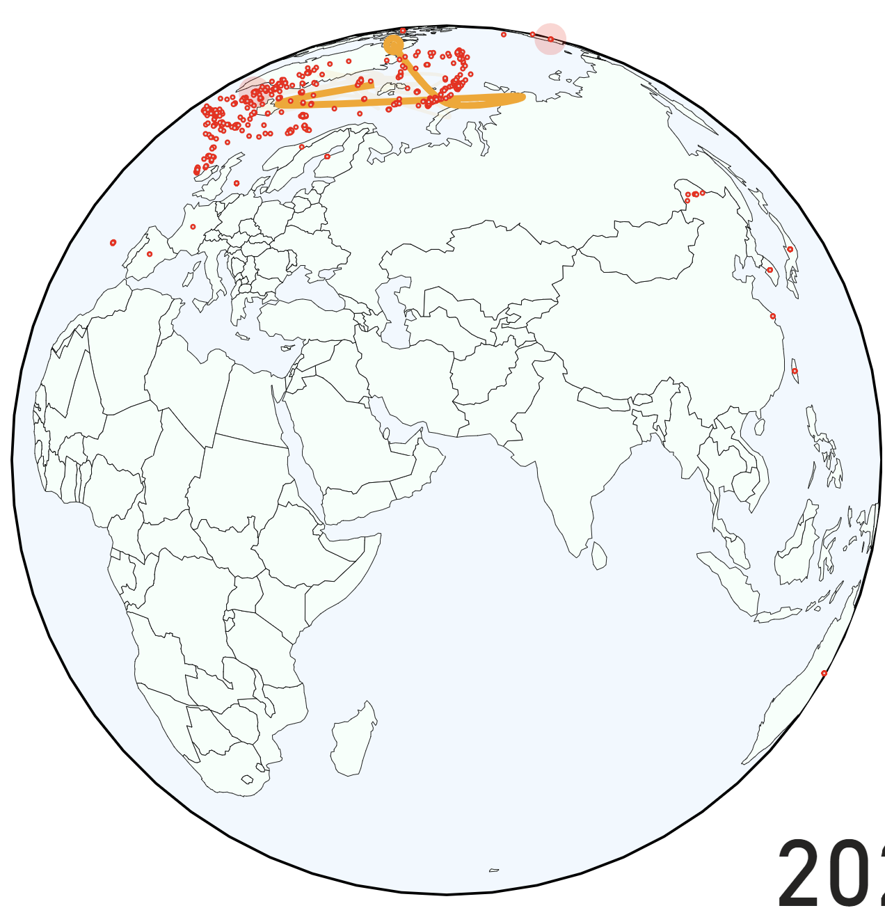
Shout out to my LinkedIn connection and Vega guru Andrzej Leszkiewicz for helping with the solution! I encoded the opacity to be a function of the map rotation parameter. If the points are not within 180 degrees of the rotation parameter they will be invisible. Note that if I had brought the data in as geojson this step would not be necessary, but it seems that in Power BI/Deneb, this is not possible.

Auto rotation in action as seen in 1995: 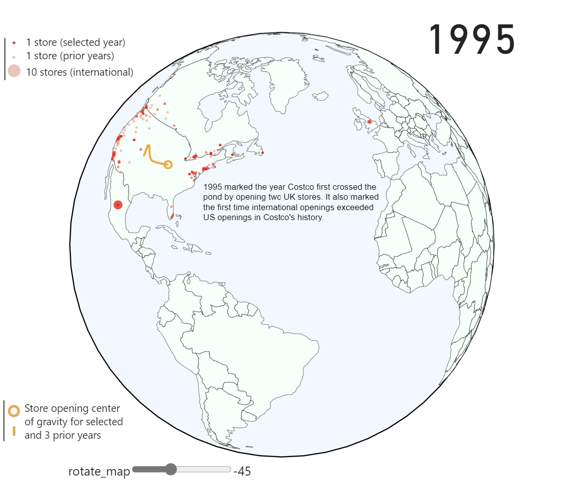
Costco score map
I have an entire blog post dedicated to my process for creating a choropleth map with points on it, so rather than rehash that I will be discussing some of my data gathering for making the Costco score map and the
Map highlighting counties without Costco or Sam’s Club and hovering over high “Costco score” Teton county: 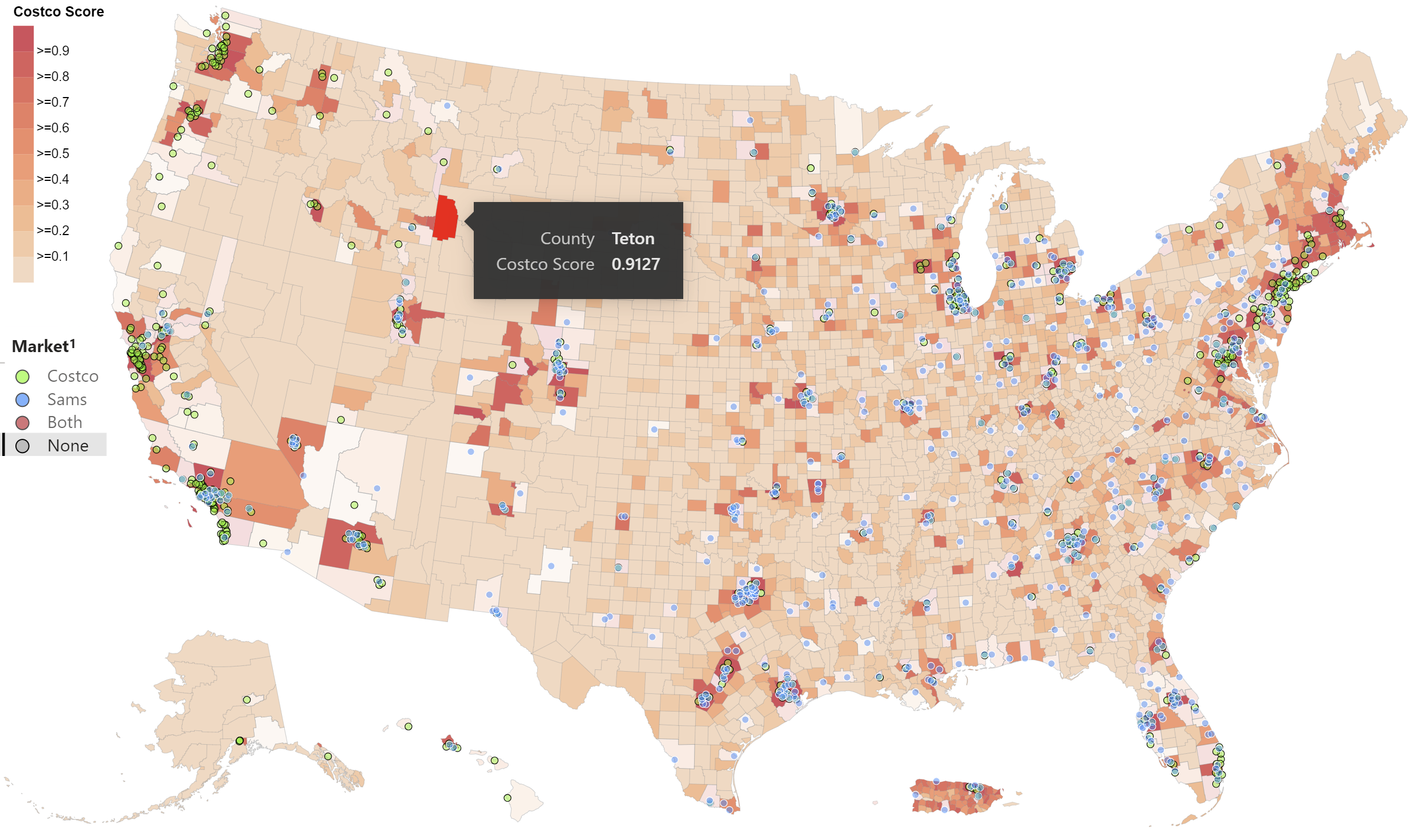
Data used to create this map came from the US census API (this data is also used in the jitter charts in this project): 
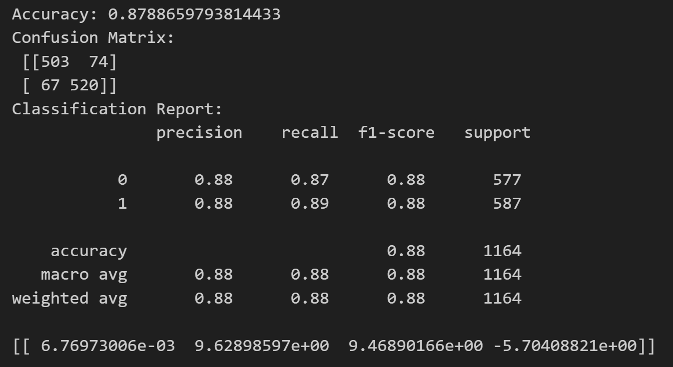
Using the data from the census (and Costco location data which I described reverse geocoding in another blog post) I created a logistic regression model to forecast a counties suitability (probability) for getting a Costco. Given that there are hundreds of counties that would be suitable for a location but don’t have one yet I used SMOTE (synthetic minority oversampling) to balance my dataset: 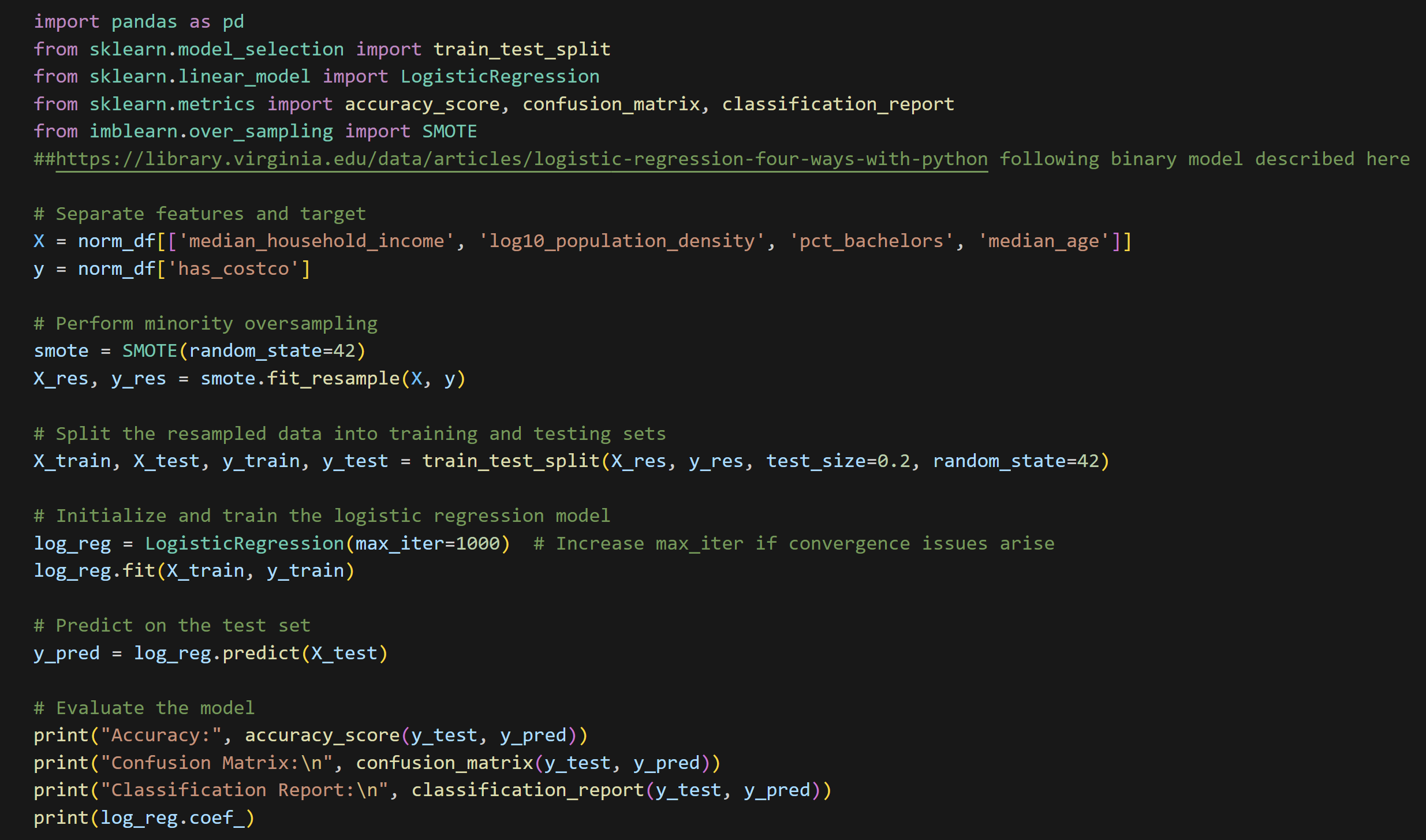
Model results:
One issue that I ran into when producing the map is that Connecticut recently redistributed all of their counties into “planning” regions. The relationship of old counties to new planning areas is not one to one. My topojson (map) file had the old county names while the latest census utilized the new planning areas. In order to marry the two datasets I created mapping tables for each to the other, and using bi-directional cross filtering and an intermediate table I was able to fill Connecticut in my map with data from the Census.
See the crosswalk tables below: 
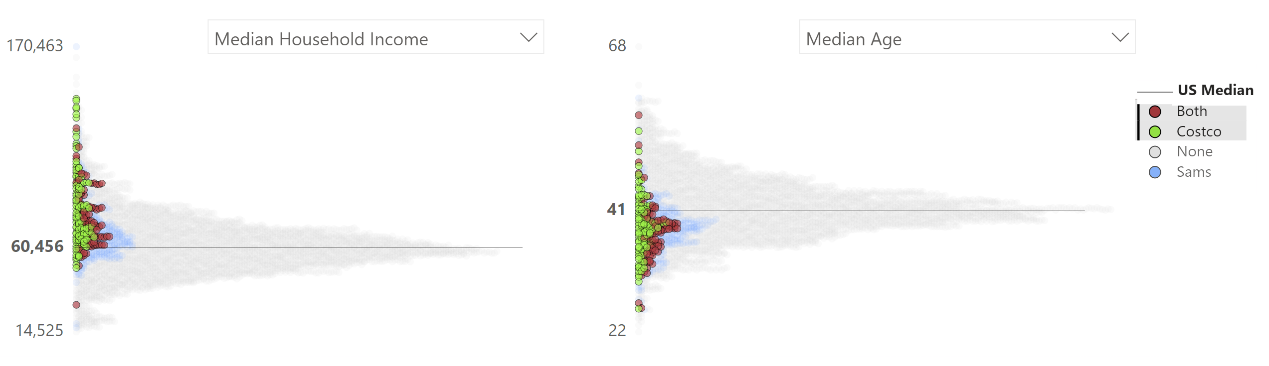
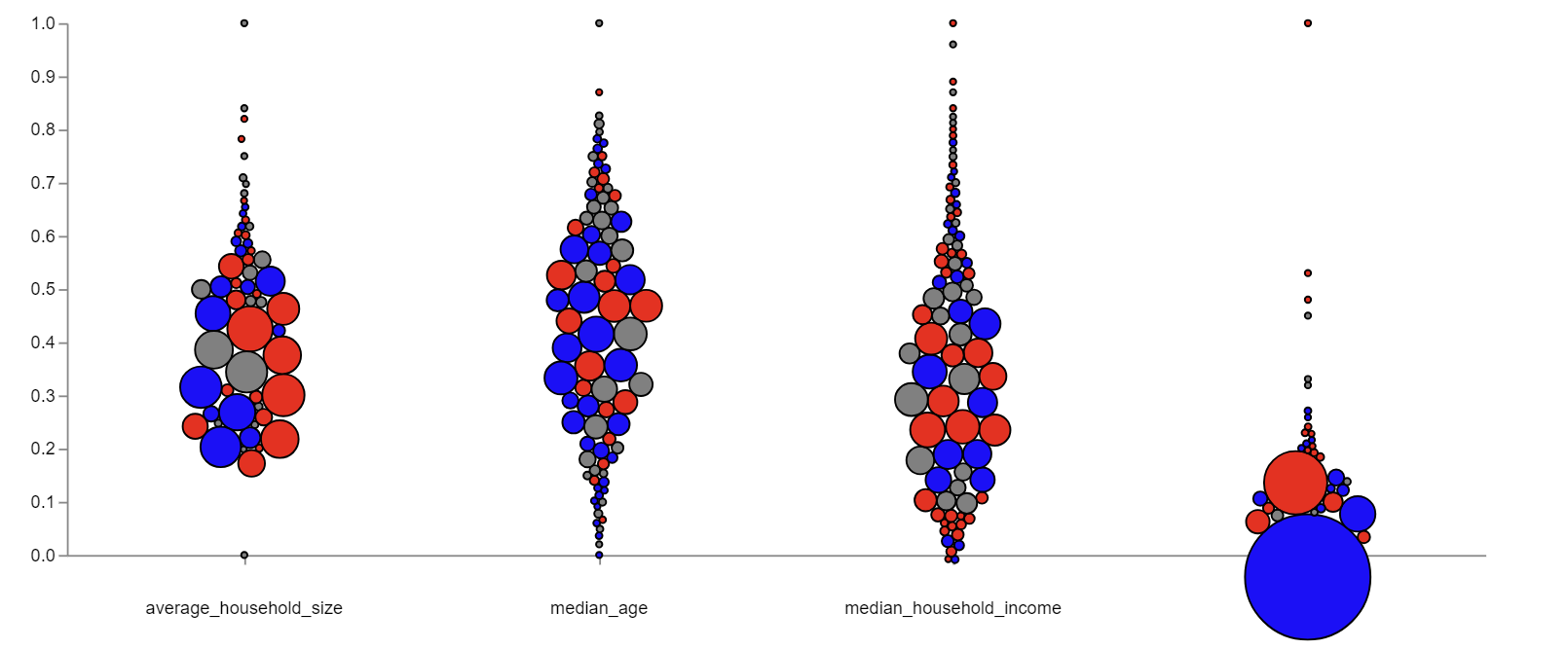
Jitter charts with median
What I am calling jitter charts went through multiple iterations to arrive at the charts seen below. Though I am happy with the result, I believe that there is still room for improvement on color scheming and creating the spacing for the variables which require plotting on a log axis.
I wanted to take full advantage of Vega and Deneb’s interaction capabilities in this project. Users can hover over any point any see what county they are looking at with a tool tip. When investigating an outlier a click on the point will highlight it on the other charts as seen below. This interaction carries over to the entire report. Clicking a county on the map will highlight it on the scatter charts and vice versa: 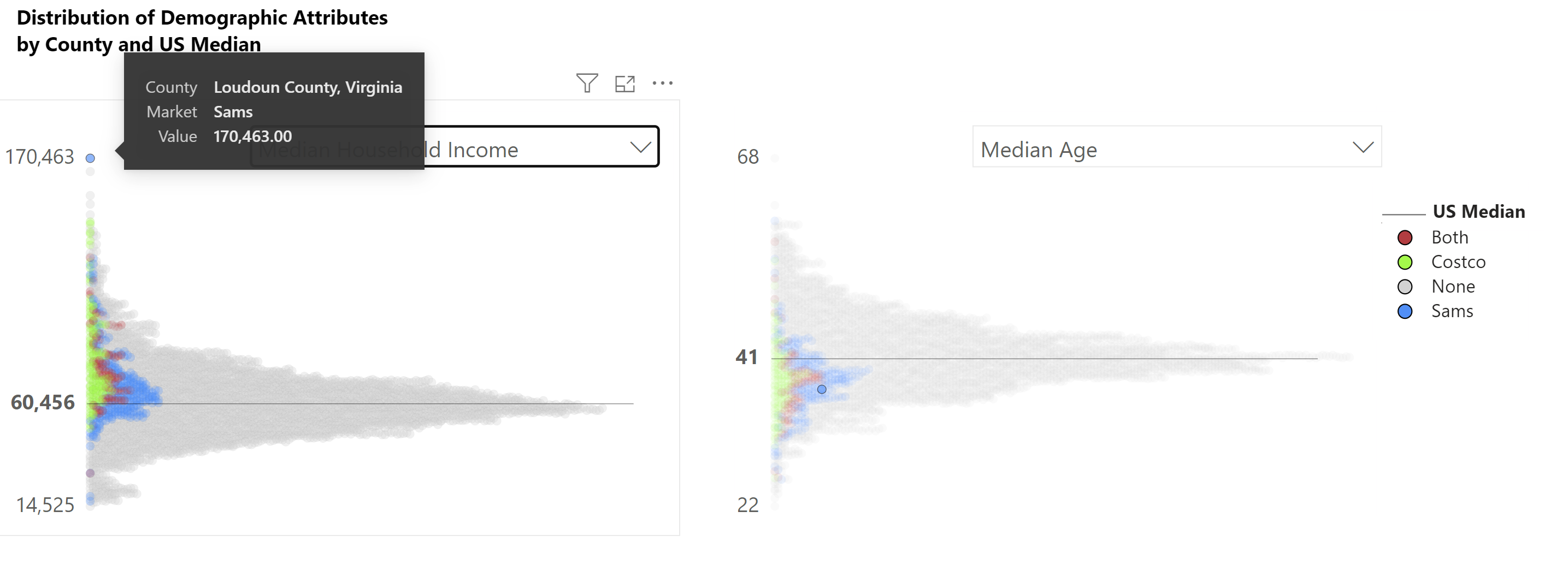
I was also able to make the legend interactive. Clicking on one of the market groups highlights the associated points:
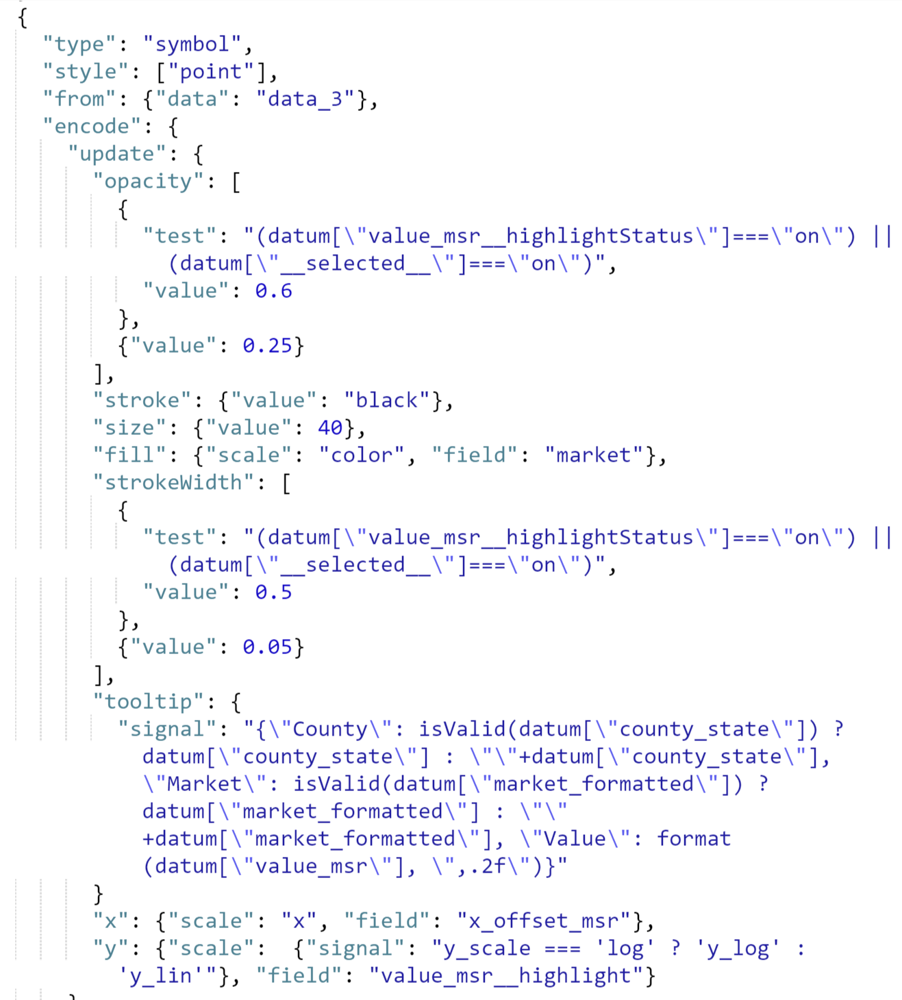
In Power BI core visuals cross-highlighting happens behind the scenes, in Deneb the “highlightStatus” is made available to the user (note that Power BI core scatterplots do not support cross-highlighting at the time of this post).
Cross highlighting requires two layers and some conditional logic.
Below is the base symbol layer, this layer has an opacity of just 10% as it provides a background image when other items are selected. Note also that in “y” I am using a signal from the dataset to determine whether or not to plot on a log scale or linear scale this is based on user selection of variables: 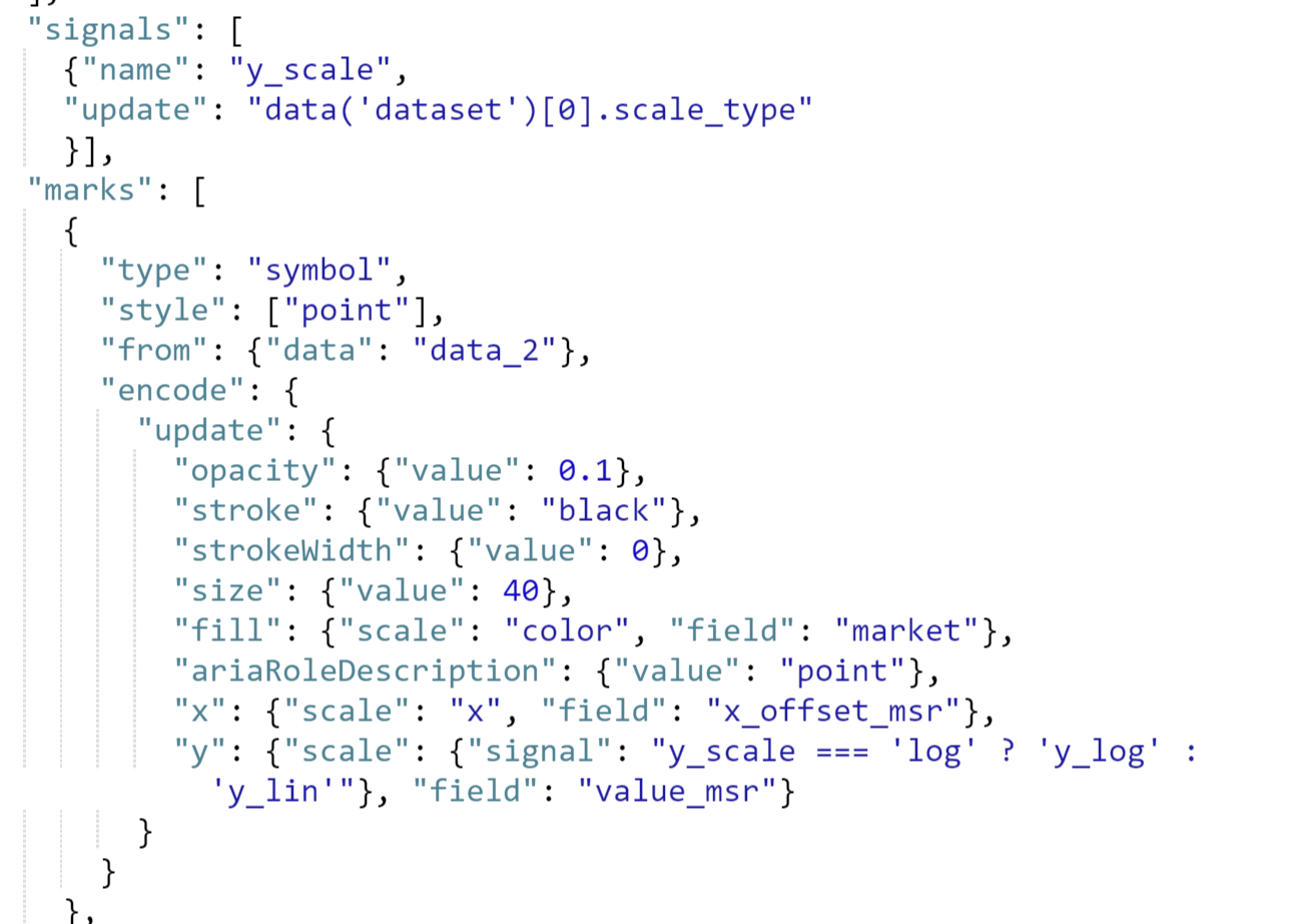
Selected symbol layer (if an item is selected or highlighted by Power BI the opacity will increase as well as the stroke width):
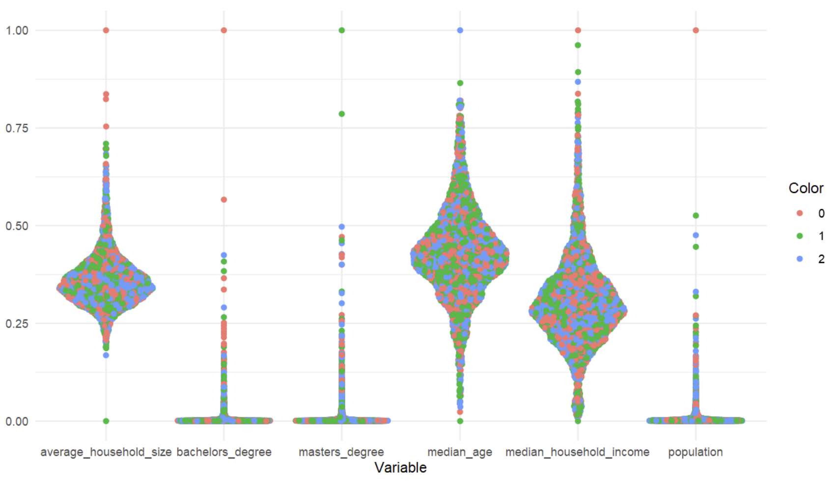
My original attempt at creating the jitter charts was using a beeswarm chart template created by Kerry Kolosko. I normalized all of the data between one and zero and plotted a sample of counties. The math used to create beeswarm charts is somewhat complex and done inside the visual so once I unfiltered the data my computer crashed.
The second version I started on was using ggplot, this plotted every county in a split second, but unfortunately ggplot only creates static images so all of the interaction would have been lost.
In my third attempt I went back to the beeswarm idea, but I grouped similar counties together. I thought it was a great idea at first, but the result looks clunky and some of the larger groupings are so big the displace other groups.
My fourth attempt is fairly close to my final version, at first I built these to look similar to sina plots. In order to create these plots I preprocessed the data in python, calculating x offsets by data bins. A snapshot of this code is included after the examples:
 |  |  |  |
Python code to create x offsets: 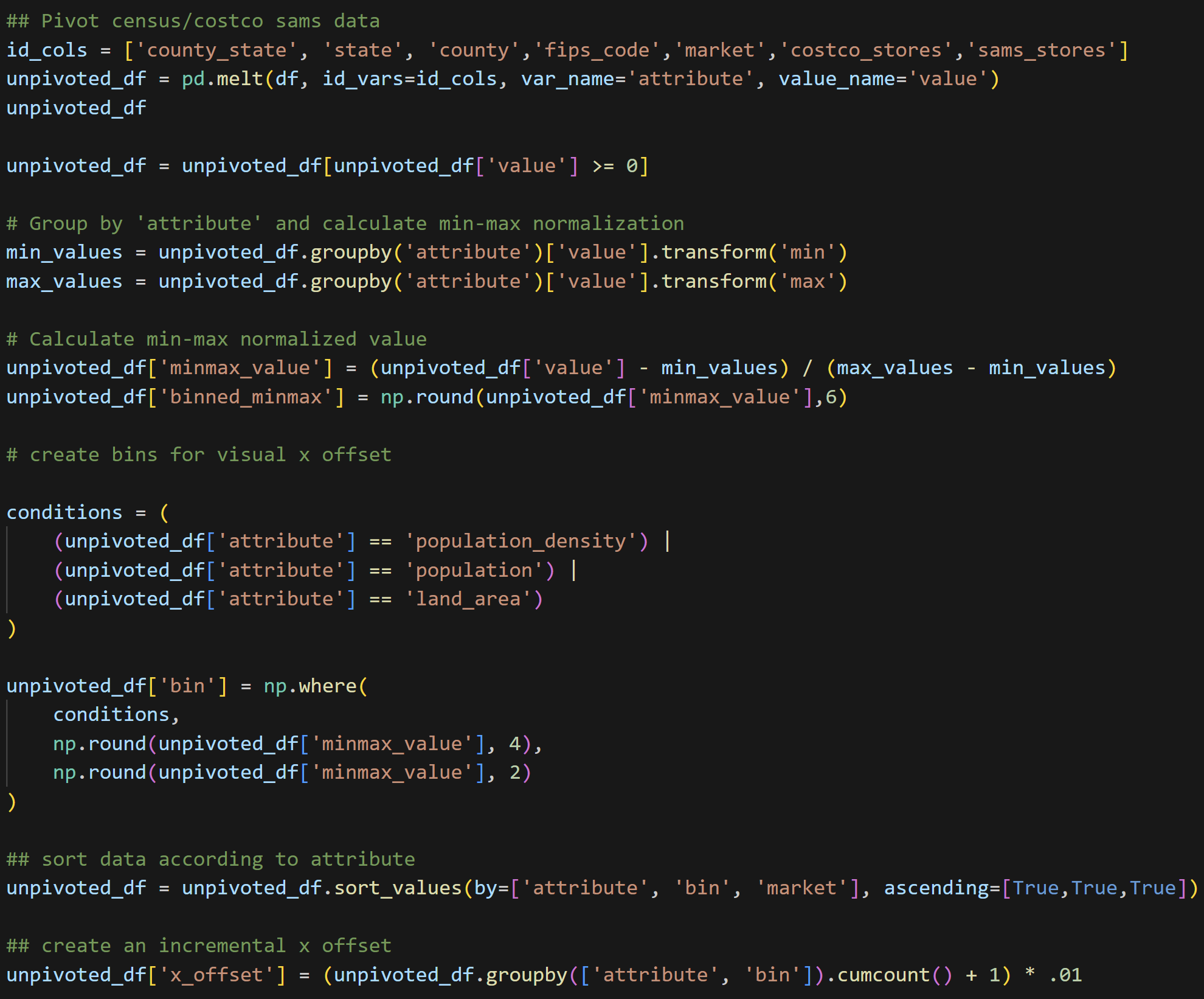
Wrapping Up
Is this project 100% complete? I don’t think so, there are a few points I acknowledge that still have room for improvement, but I do think I’ve created a great base for improving upon. I plan to take a break from this project for a while, but revisit in October when Costco releases their 2024 financial statements.
So what do I think could be improved upon?
Color selection for one. I really struggled finding a color scheme that would be distinguishable on the US map and also look good on the jitter charts. I’m not sure I succeeded in both goals. I think the “lawn green” I used looks great on the map, but too vibrant on the jitter charts. I originally tried to use the Economist’s color palette for the map, but perhaps because the Economist’s colors are more muted (or because I am red/green color blind) the store location markers got lost in the orange of the map.
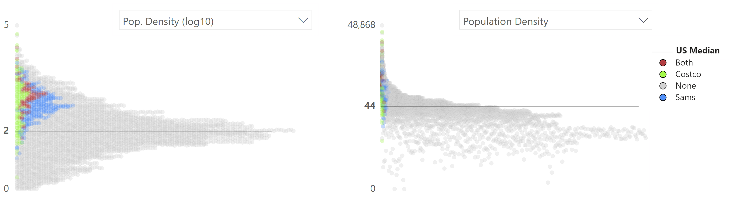
One other item which I am not completely satisfied with is way the population density graph turned out. I used the log10 of population density in the logistic regression for this report and in my preliminary charts. While using the log transformed data was the right choice for the machine learning model, I knew that log10 of population density wouldn’t be as meaningful for users in the charts. I focused too much attention on the log transformed data and as can be seen below, the original data, even plotted on a log scale looks more clumped together. The python script I wrote to pre-calculate the x-offsets will need some fine tuning.
Finally, the demographic analysis is almost entirely interactive, but I am not sure I made this clear to users. Users can click “none” in the map to highlight counties without “Costcos” (or any other item in the legend), sort the county level table either by any attribute present, or click any county in the jitter chart to highlight it on the other charts and map. I had planned to make this interaction more apparent by using bookmarks in Power BI to create a sort of walkthrough, but ran out of time to work on it. It may be a good thing that I didn’t try to create the walkthrough using bookmarks though. Walkthroughs using bookmarks rely on a large number of text boxes conditionally hidden in a dashboard. I already have a large number of elements on the demographic analysis page which made moving and formatting items slow and at times challenging.
In all though, despite the shortcomings, I am happy with the result of this project and everything I’ve learned. At the beginning of this year, I worked on recreating Napoleon’s March through Moscow using Vega Lite. What took me the better part of a weekend then would probably take an hour or two now, I simply feel more confident using Deneb, Vega, and Vega Lite. Also, what started as a mission to learn Vega Lite, ended with me knowing that I have a preference for Vega (I sense a blog post coming soon about why I prefer Vega over Vega Lite, but where Vega Lite shines). My biggest takeaway from this whole process was learning how to create custom highlighted visuals in Power BI using Vega. I now feel like I can conquer any visualization challenge that comes my way in a business dashboard moving forward.
In the end I started my first blog post stating that as a Power BI user, I’ve had Tableau envy for its ability to create more bespoke visuals. After 4 months learning Vega and Deneb, I can confidently say that envy is gone.