Book Review and Tuftian Box Plot
Introduction
Is data visualization an art form, maybe?
Having long seen Edward Tufte’s Visual Display of Quantitative Information appear on must-read lists and getting plugged in Amazon reviews of other books, I finally decided to give this classic in data visualization theory a read.
My initial thoughts:
For starters I really hope Dr. Tufte never sees this review.
I can see why it is so popular though, the book is not as cranky as I expected and fairly easy to read. Much of it reads as if it could have been written last week, and much (but not all) of the advice still needs to be heard. As I went through the book I couldn’t help but feel like a person watching Casablanca (or the Matrix) for the first time in 2024. What may seem as a cliché at this point is because it inspired many other works (including my first post on this blog of course).
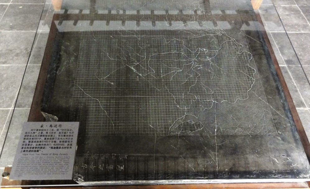
In the book Tufte provides a tour of famous infographics throughout history, including the Yu Ji Tu map engraved in 1130’s China which I am hoping to see when I visit Xi’an this summer and Charles Joseph Minard’s map of Napoleon’s Russia campaign which I’ve already written about.
He also covers a few mathematical formulas for evaluating the “effectiveness” of a chart, but a notable omission is any discussion of color theory, or pre-attentive attributes.
The Formulas
Tufte is most certainly a statistician and presents a few formulas which can be used to evaluate a chart:
• Lie Factor = size of effect shown in graphic / size of effect in data
The lie factor requires a distorted chart, there are some great examples in the book. Basically, if an item in the graph should be 20% larger on the graph but you actually measure it to be 50% bigger you have a lie factor of 250%. what I was really hoping to find some recent charts with distortion to calculate the lie factor, but alas my usual reading material hasn’t turned one up yet. Maybe I need to switch to a tabloid for a week and report back. One major culprit of a large lie factor are 3d charts which are rare in the wild nowadays I think. 3D pie charts are legendary now I hear.
• Data Ink Ratio = data ink / total ink used in the graphic
Though this idea is great in principle, I think it can be easily taken to an extreme. Some of the examples in the book push the limit for me while still looking good. There can always be too much of a good thing, or in this case too much of too little of a thing? Anyways, I think this is where designers and Tufte clash the most. Is 1 the perfect data ink ratio? I don’t know, some of his revisions are pleasing to the eye, and others just aren’t for me. I explore an application of this ratio in Vega further down.
• Data Density = number of entries in data matrix / area of data graphic
The data density ratio advocates for a prudent use of space for data graphics; according to the author, a small data set should yield a small graphic or none at all. This is one area where I disagree, Tufte claims that visualization should only be used for large datasets, but by my count the graphic showing the change in tax receipts as a percent of GDP by country contains only 45 data points. This small criticism aside I think the ratio is a valid one, Tuft provides illustrations proving the human eye’s ability to resolve extremely fine detail.
The Tufte box plot
One of the major applications of the data ink ratio is Tufte’s revisioning of the Box-Whisker plot. He presents a few versions of a pruned graphic, and though I am not a fan of the Box-Whisker “final-form” he presents, I really do enjoy one of the intermediate versions (see below); I think the use of negative space is fantastic.
Of course I would take this opportunity to get some more practice in with Vega, check the “Show Boxes” toggle below.
Which do you prefer?:
Another potential application of one of Tufte’s ideas, double functioning labels, would be to replace the dot in the Tufte version with the actual median.
(Note that this chart is 1.2 times taller than it is wide, that’s the inverse of the minimum aestetically pleasing ratio according to Psychologists according to Tufte!)
Chart Junk and Jitters
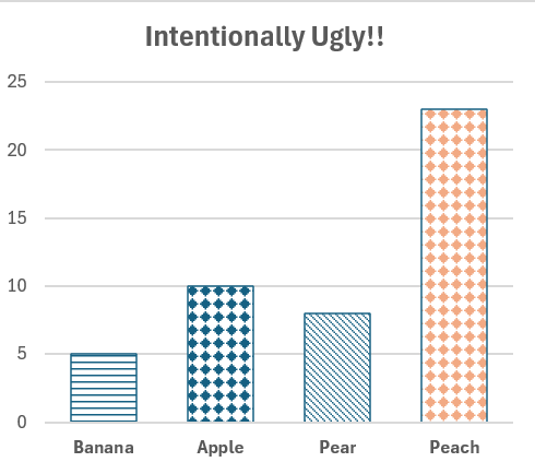
If there’s one thing I agree with in the book, jittering effects (or pattern fills in Excel) need to be eliminated. Can you imagine being in a meeting and saying “no no bananas are the horizontal lines, peaches are plaid”.
‘Chart Junk’ are all the extra visual elements in charts and graphs that are not necessary to comprehend the information presented. These things distract from the data itself and might be artistic accoutrement or as simple as grid lines which are too dense or just plain unnecessary to comprehend the graphic. While I could delve into the many ways that chart junk clutters our visual field, I’ll keep it concise: according to Tufte’s stringent standards, if it aint data it’s chart junk!
Final thoughts
Some of Tufte’s ideas are controversial, especially due to his dismissal of designers, and non-mathematecians in data visualization. Some of the best visualizations I’ve seen have been done by humanities majors who taught themselves to code. I would certainly recommend this book to anyone interested in data viz, but a panacea it is not.
One thing we can hopefully all agree on is that “the only thing worse than a pie chart is several of them”, but I bet in 20 years I will still get asked to add them to slide decks.

