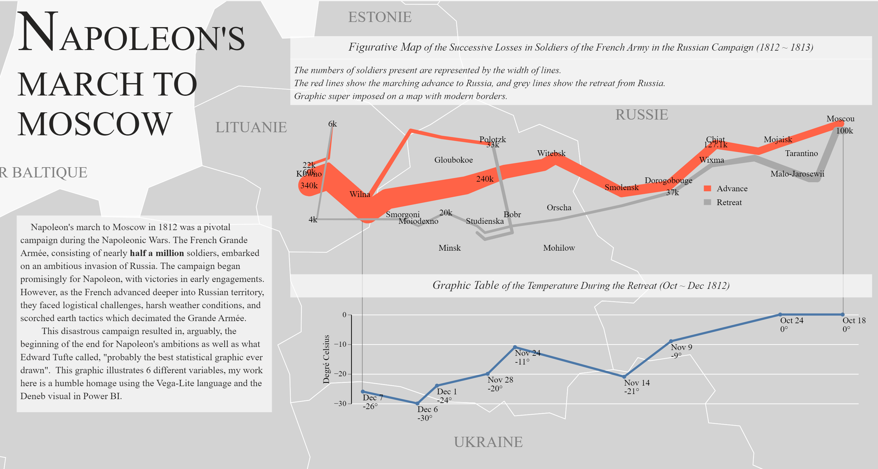
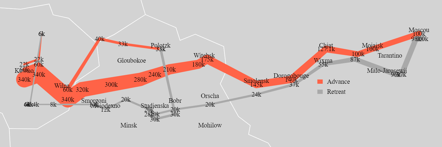
Napoleon's March to Moscow in Power BI (via Vega-Lite)
The Download
If you just want to download the Power BI file, here it is.
This is My First Post!
I have thought about starting a data analysis blog for years, and never gotten around to it. Currently I am doing an independent study in data visualization at the University of Miami which has two requirements (among others):
- Start a data visualization blog (you are here)
- Learn something new
So here’s where the rubber hits the road, I suppose!
Learning Something New
To cover the learn something new requirement I’ve decided to focus on learning the Vega and Vega-Lite languages, which are abstractions on top of D3.js, allowing users to use a declarative language. As a primarily Power BI user, I’ve had Tableau envy for years over the more flexible and custom way Tableau visuals can be built. Power BI has its advantages though, and since the release of the Deneb visual which allows embedding Vega visuals I’ve been seeing more and more development of some amazing visuals in Power BI using the Deneb visual and Vega language.
Why not ggplot?
Power BI has had the ability to display ggplot visuals for years now, but as far as I currently know, to display tool tips and allow interaction ggplot visuals require development as actual custom visuals that need to be imported. With the Deneb visual the interaction and tooltips only need to be declared in Vega. I will admit, though, when comparing the 100+ lines of code I had to write for this graphic to the 15 or so lines ggplot needed for comparable graphics, I had thoughts of starting over. The JSON structure is also not as user-friendly as ggplot’s syntax. I’m hard-headed though, and really admire some of the work I’ve seen done in Vega. Maybe this will be my gateway drug to D3.
Inspiration
I’m currently reading the Visual Display of Quantitative Information by Edward Tufte, more on that another time, but among the first few pages Tufte sings the praises of Charles Joseph Minard’s figurative map of Napoleon’s Invasion of Russia. I’ve always enjoyed looking at maps, add a time-series on it and now you’ve got my attention:
After searching around the interwebs I even found a ‘contest’ to re-vision this classic graphic. Since I didn’t see any entry using Vega, I decided that this might be a great way to get my feet wet with the language.
Connected Scatter
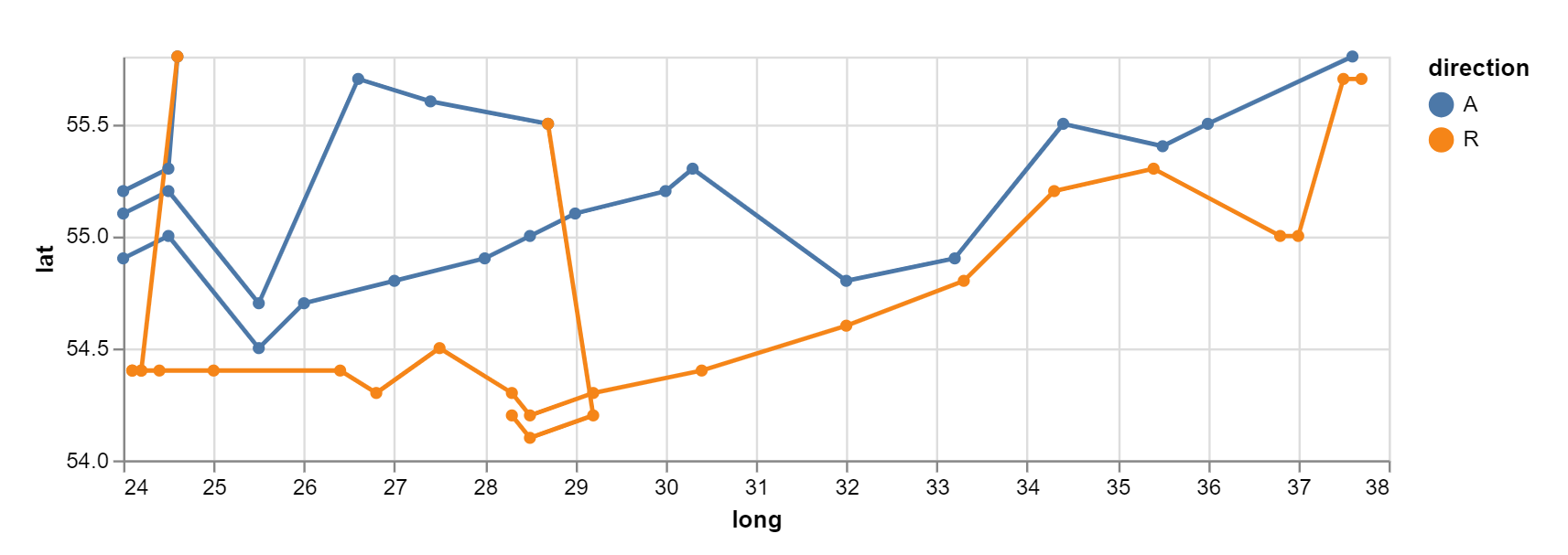
A great place to start for creating visuals is the Vega examples gallery. Though I should have known better, scrolling through the examples my first thought on tackling this challenge was to use a connected scatter plot:
Trail Mark
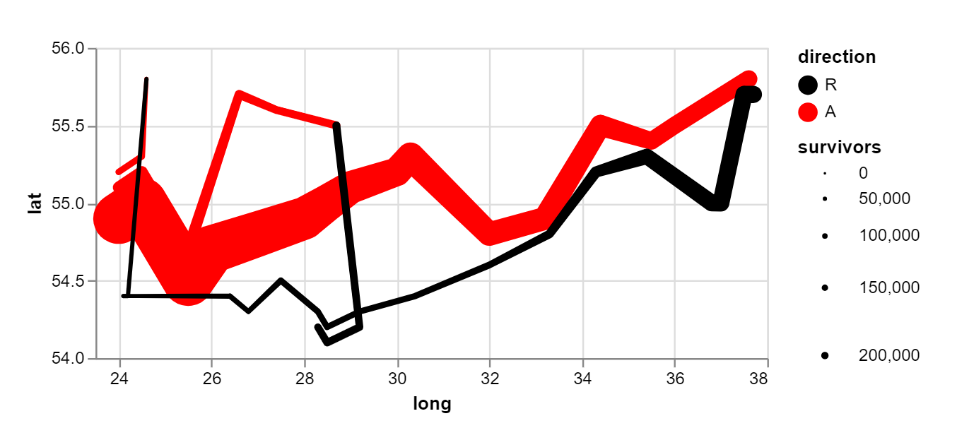
Looking at the connected scatter plot, we are obviously not encoding for the number of soldiers variable. Reviewing some of the revisioning Minard contest entries (specifically the ggplot entry) I realized I needed something akin to the path mark, Vega has this but calls it a trail mark:
Adding the Map
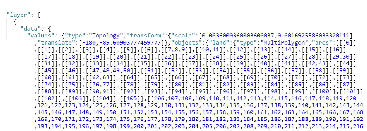
Unfortunately Power BI does not allow Deneb to connect to any external data sources, which makes maps a bit more challenging. Browsing the Vega galleries, you can see that the topojson file for a US map is simply linked. Thanks to David Bacci’s Covid Map I was able to figure out the topojson needs to be added in line.
Navigating to https://vega.github.io/vega/data/world-110m.json I was able to find the appropriate topojson for the project.
and add it in line to my code:
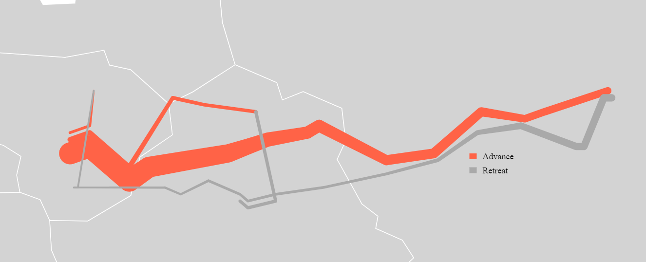
resulting in a time series overlaid on a map!
Refining
One feature I wanted my version of this map to have, was the soldier counts in addition to the city names.
Adding two different text marks looks like this:
Too cluttered! Since this is a Power BI and Vega Lite project I decided to use Power Query to come up with a solution.
The original soldier count data series actually includes three distinct groups that joined together along with their marching direction (Attacking,Retreating). I decided to show a text mark for the first data point in each group and direction, then skip subsequent data points in the same group/direction at even intervals.
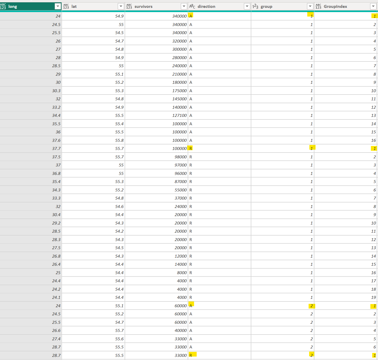
I created a group index in Power Query using the group by feature.
and then created a calculated column (this could have also been a DAX measure) to return formatted text for the first data point for each group and 6 intervals, and a blank for other points.
Passing this column to the dataset which Deneb uses resulted in the graphic at the top of this page.
There is still some crowding around city names and survivor text marks which I would like to solve in a future update.
Country names are text boxes which I manually arranged.
Degré Celsius and City Names
For now, I will be skipping over this portion of the graphic. Unfortunately, at this time, I cannot find a way for Power BI to allow multiple data sources to be passed to Deneb. Given that this graphic is actually composed of three datasets: soldier levels, temperatures, and city coordinates, I had to hardcode the city coordinates in the first graphic. The temperature chart is a separate visual which I aligned with the first.
