Book Review - Fundamentals of Data Visualization
Introduction
Fundamentals of Data Visualization by Dr. Claus Wilke is one of those famous technical books from O’Reilly Publishing with a white background and some animal on it. This time it’s a Parrot.
This is a book that’s “a mile wide and an inch thick”, and I honestly can’t wait to read it again, or certain chapters at least as needed.
I highly recommend it.
Due to its comprehensive nature, reviewing this book is somewhat challenging. There are 29 chapters which cover a wide array of data visualization techniques. I plan on touching on the points which I found the most helpful or where I learned something particularly interesting. To be clear, I learned a lot from this book, but I won’t be mentioning everything.
Despite the name “Fundamentals” I think even advanced data visualization practitioners would benefit from reading this book. There are many techniques discussed that I’ve used in the past, even simple ones, where I learned something new or a new way of looking at a problem.
Ugly, Bad, and Wrong
One thing I appreciate about this book is that Dr. Wilke doesn’t just give us beautiful examples.
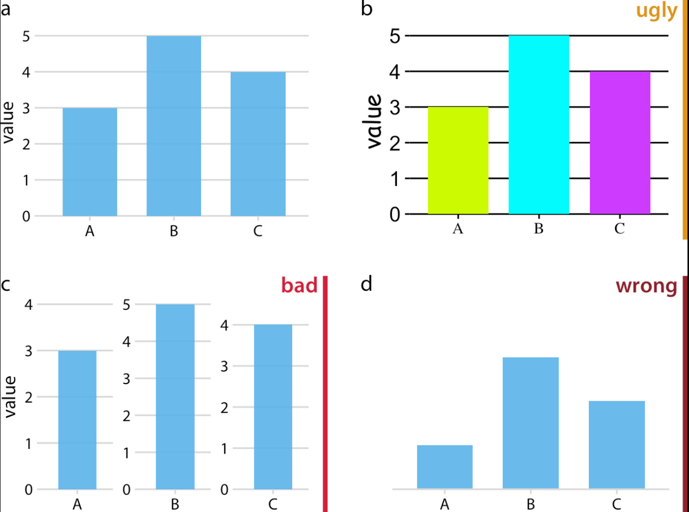
Throughout the book the reader is given examples of ugly, bad, and wrong charts.
- Wrong charts are those which have critical math errors, missing axis labels, or are otherwise dishonest.
- Bad charts are those which are misleading, or otherwise hard to interpret, but not wrong.
- Ugly charts are those which otherwise have no mathematical errors or distortion, but are just plain ugly!
This distinction throughout the book can save people from making critical mistakes when visualizing data (though to be honest I strongly prefer the screaming cat in Big Book of Dashboards to make this distinction).
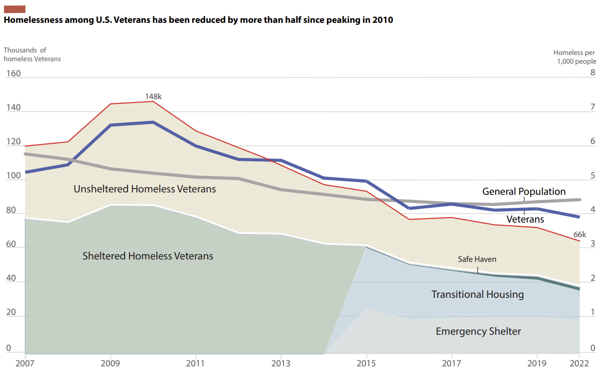
I have been wanting to update the graphic at the end of this section with the latest information from HUD and the Census, but do something more ‘creative’.
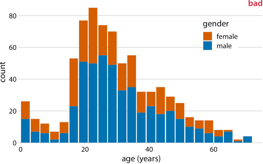
One thing the bad criteria saved me from doing was creating a stacked population pyramid to update a stacked area chart graph I made in the past detailing veteran homelessness.
In the bad example, Dr. Wilke illustrates that the number of female passengers can’t be compared from one age bucket to another so readers can only accurately determine the total number of male passengers.
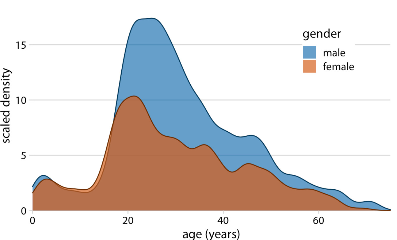
By using opaque density estimates, one can determine both the proportions of males and female passengers and compare the total amounts of each easily.
One downside of population density estimates I hadn’t previously considered is that in some cases the estimate may plot data where there is none in the original dataset. Just something to be mindful of for future me.
My original graphic (below). While this is a stacked area chart using total amounts rather than density estimates, this book may influence how I recreate the chart. My original plan was to create a stacked population pyramid (the bad chart rotated 90 degrees and mirrored).
Key Takeaways
I am simply going to post two quotes from the book here for my key takeaways.
Takeaways 1 and 2
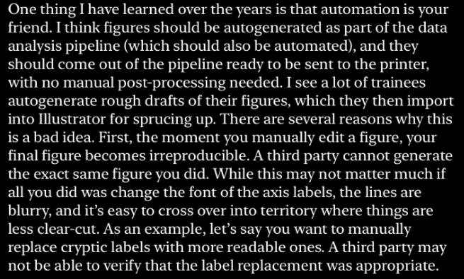
The first item is the only time in the book Dr. Wilke actually asks us to implement anything from his book, I have to admit that axis label font size is usually the last thing I think of when making charts.
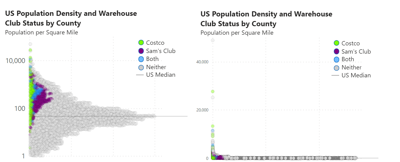
The other completely unrelated item is with regard to log scales. I use log scales all the time, but I never really thought about a rule for using them. Usually I just use a log scale when I have data of different magnitudes.
Below is a chart I recently created. While the need for a log scale in this instance may seem obvious, I thought I’d illustrate the difference in using a log scale as well as increasing the axis label font size in a single image.
Takeaway 3
The final takeaway, which appears among the first pages of this book, and is reiterated multiple times throughout is that as much as possible of your graphics production should be automated. This principle applies to data pipelines as well as the actual graphic production.
I try to follow a code first approach in my work and when designing graphics (or at least eliminate as many manual steps as possible), but automation is often a luxury. Ideally every graphic and data analysis pipeline I do will be immediately reproducible, but sometimtes the reality is you have a couple hours to put something together and have to resort to Excel and PowerPoint/Illustrator. I am supremely thankful for the skills I have learned in Adobe Illustrator sometimes when I need to make something look nice quickly.
Posts in this blog so far have followed a code first approach. In my entry for the Du Bois challenege I was asked why I didn’t use Illustrator to produce the tear and opted for code. One of the reasons was reading this book, the other was a personal challenge. Although that graphic took probably 20 times longer to develop in Vega than it would have in illustrator, anyone can reproduce it, and I can use the technique again elsewhere.
Rules are meant to be broken
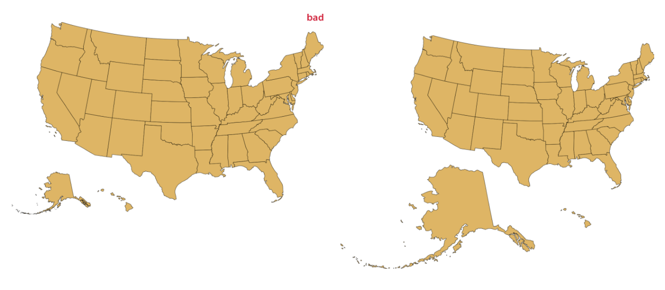
In my prior post I discussed the AlbersUsa projection, which Dr. Wike derides in the book. I started work on the map in that post before I got to this section in the book and had a good laugh when I got there.
Dr. Wilke suggests an alternative projection showing Alaska at its true size.
Maybe I’m biased because again, no Puerto Rico, but I am not a fan of the good version. Alaska is too small in the usual Albers projection, but there isn’t much going on in 90% of the state. As someone recently reminded me, data visualization often requires making trade-offs. In some cases I’m willing to make the sacrifice of having an unrealistically small Alaska to have a better layout on my canvas.
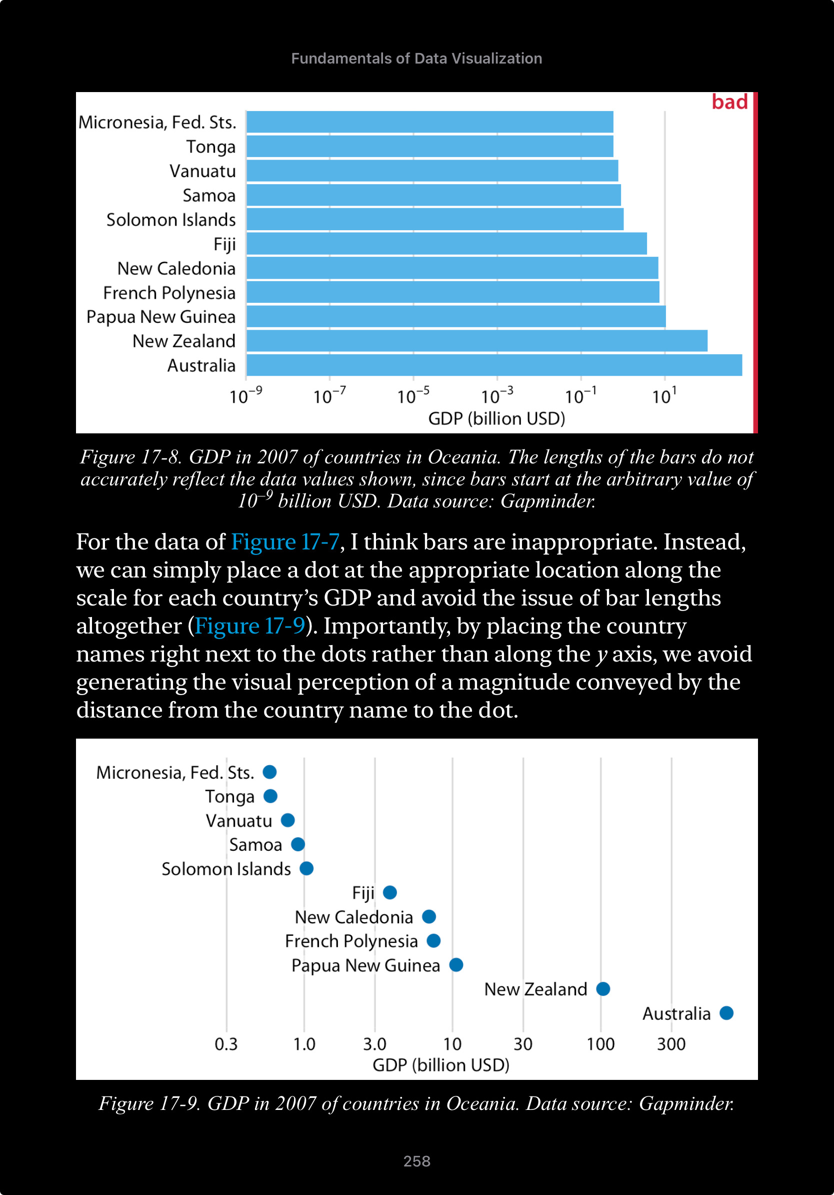
Another area where I may have to selectively ignore Dr. Wilke’s advice is in the dots vs bars rationale below.
I actually think this is great advice and this example is a beautiful illustration of his point, however in my example above of population density, if I wanted to show the median value of population density for each market group (Costco, Sams, Both, Neither), a dot plot may not look good. The one chart already has over 3,000 dots, another chart on top of it with four more dots wouldn’t look good and therefore I’d go with bars.
The Case for Pie Charts
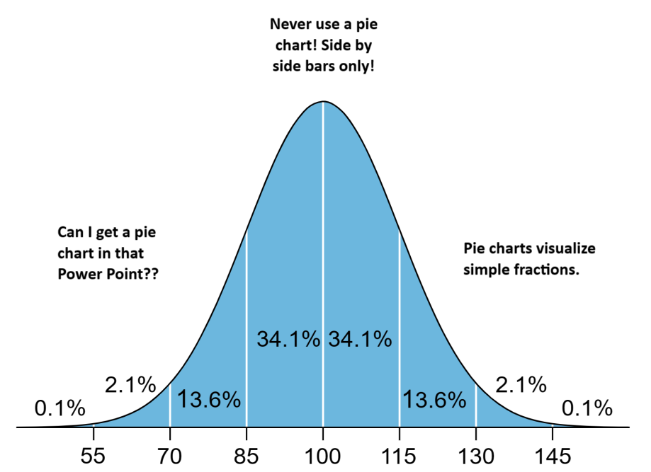
There is a popular meme template I was reminded of when reading this book, I don’t think I should publicly post the original, but it looks something like this.
The joke is that sometimes the uneducated opinion and the expert opinion end up being similar, and conflict with the opinion of the average practioner.
Many data visualization enthusiasts, myself included, cringe at the thought of adding a pie chart to a PowerPoint presentation requested by someone who hasn’t read Storytelling with Data (another great book).
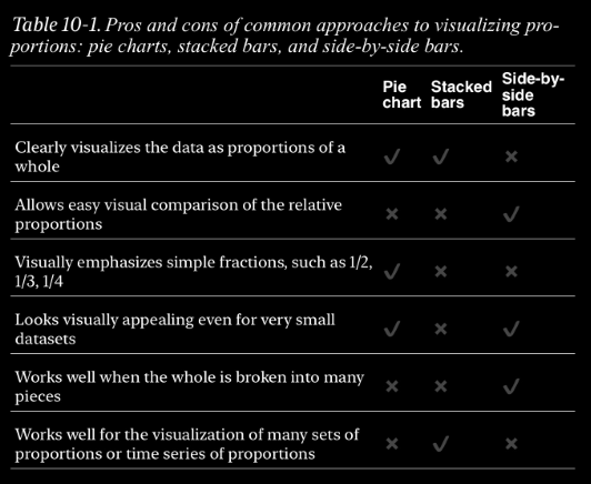
In the end Dr. Wilke makes a compelling case for the pie chart, and even gives a great rubric for when to use one. In short Pie charts are great when you are trying to show something as a percent of a whole, or show simple fractions like 1/2.
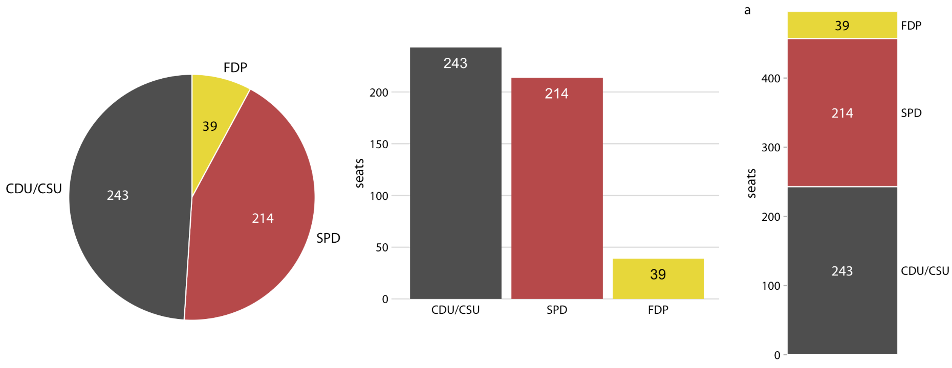
In this example of parties in the German Bundestag in the 70s a pie chart more succinctly conveys that the SPD and FDP coalition had more seats than the CDU/CSU (considered a single party).
