Dubois Challenge 2024_2
W.E.B. Du Bois Challenge
There have been many great things written about W.E.B. Du Bois by people more eloquent than me.
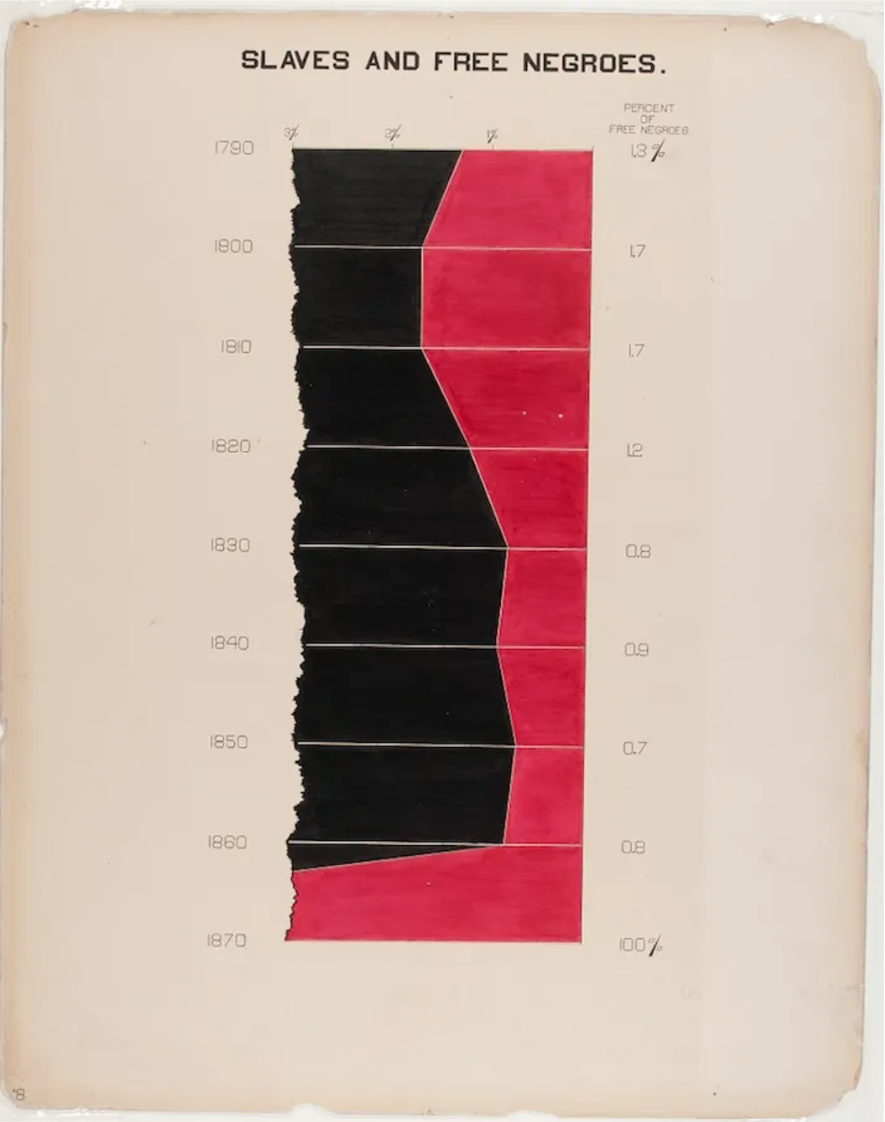
In short though, among many other things, born in 1868 W.E.B. Du Bois was a Black sociologist, historian, civil rights activist, and pioneer in data visualization.
Du Bois’ hand drawn data graphics were included in the 1900 Paris Exposition and are still inspiring people today as made evident by Anthony Starks’ #DuBoisChallenge2024 which I am participating in by means of this post.
Here is a post from the Smithsonian discussing some of these data graphics in more detail.
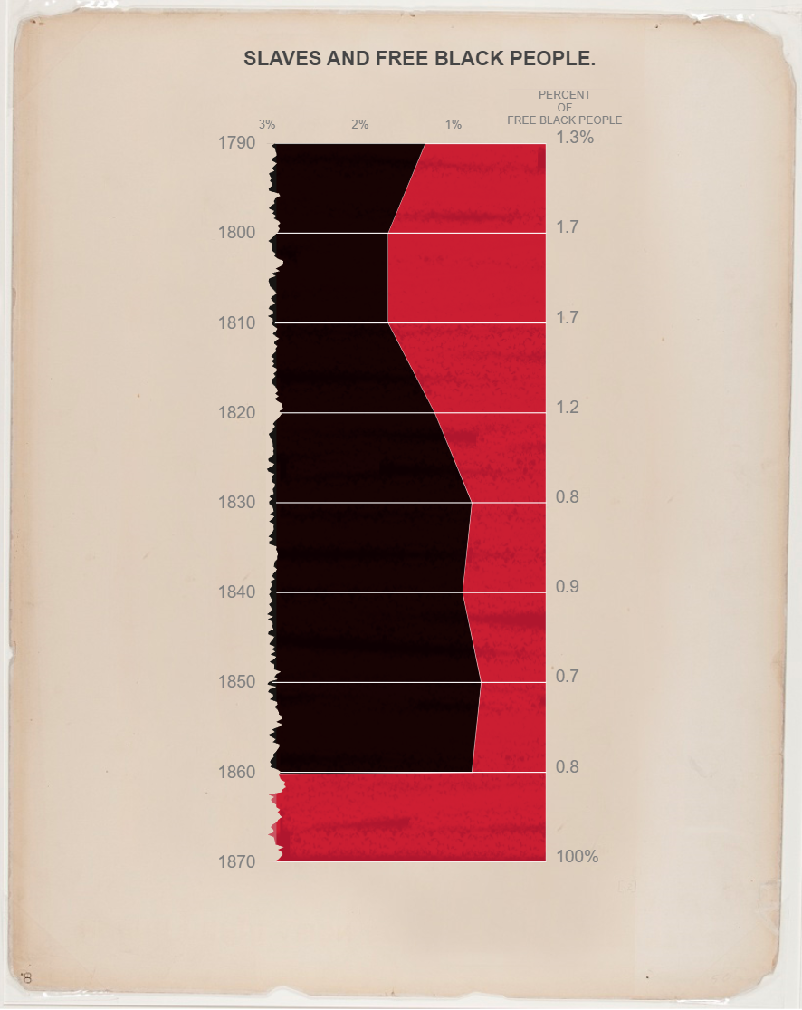
The graphic
There exists in many circles the idea that a chart should be instantly understandable to be good, viewers should be able to get to the point without needing to digest anything.
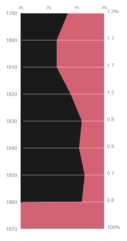
I will admit that this was a chart I didn’t “get” at first glance. The x-axis appearing on the top and right side didn’t make sense, and the area showing percent of free Black people didn’t seem to be proportional to the axis.
For me, at least, taking a minute to digest and understand the chart’s contents made it more memorable and impactful.
When I realized that the hand drawn tear on the left was really an axis break, something you add to a chart when you need to plot small and large values in the same graph, it drove home the point just how much things changed in a short time frame in the 1860’s.
If W.E.B. Du Bois had drawn the entire x-scale this chart would need be about a mile wide to make the change in free Black people from 1790 to 1860 perceptible.
First try
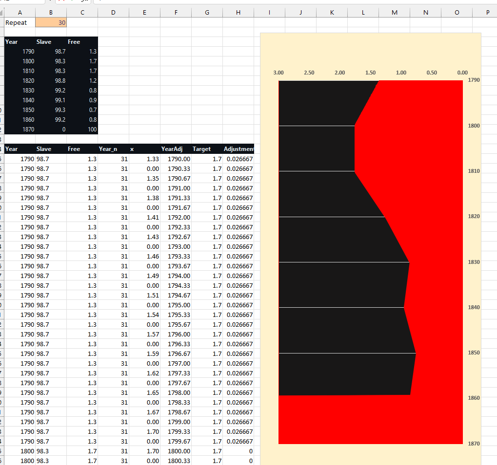
When I first decided to recreate this graphic I actually thought it would be a very quick win. So quick in fact I even started to recreate it in Excel:
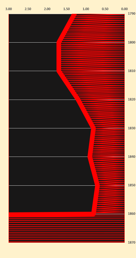
(since Excel can’t do a vertical area chart, the fill is actually a hundred or so small lines with their thickness expanded):
This was getting out of hand quickly and my goal lately has been learning Vega so in the end I decided to switch gears.
This chart is really a vertical area chart, which again, Excel doesn’t do. Power BI doesn’t either natively, but Vega does!
Calculating the tear
Based on my previous discussion about axis breaks, Du Bois’ page tear was a stroke of genius.
In my opinion, the graphic doesn’t work without it:
The fact that the data only has 9 data rows presents a challenge for creating such a granular look like the original.
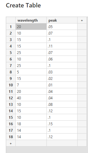
I knew a sine wave would generate a torn look, so I created a table of inputs to create a sine wave with a variable amplitude and wavelength to generate a series.
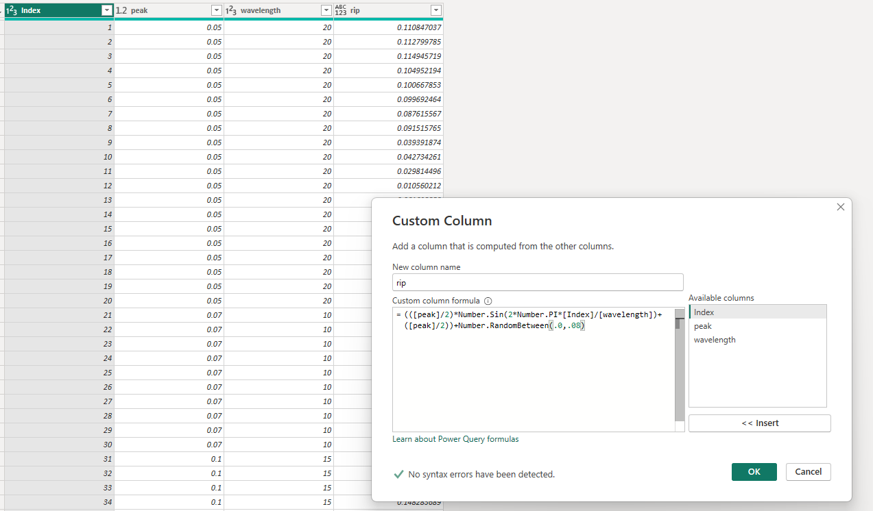
I used the List.Repeat function, which I’ve discussed in more detail previously, to generate rows based on these inputs so that 20 is repeated 20 times, 10 is repeated 10 times, etc so each wave can make a complete cycle.
Here is the result, looks like it could be a torn piece of paper to me!
I created a repeating index of 1 to 9 in the sine wave data and added an index to our source data to join the two. This allowed me to use a single dataset in Deneb to plot two levels of detail with multiple scales.
Please see my use of filter to create two distinct datasets and distinct scales from the original data in the code below.
Paint effect
This is about as low tech a solution as it gets, but I thought it would be worth mentioning.
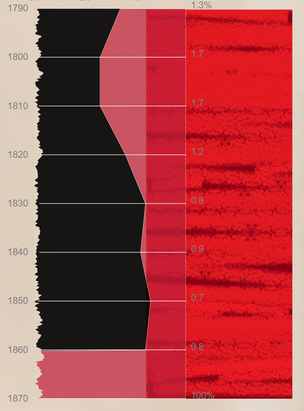
I had seen a few other people post some amazing entries of this graphic in the challenge, but to date I haven’t seen one mimicking the painted texture of the original. I increased the opacity of the area chart and threw an MS paint image I made with the paint brush behind it. I wasn’t sure about this. What do you think?
The download
Here is the Power BI file.
And just for fun the Excel version I stopped working on.
The code
1
2
3
4
5
6
7
8
9
10
11
12
13
14
15
16
17
18
19
20
21
22
23
24
25
26
27
28
29
30
31
32
33
34
35
36
37
38
39
40
41
42
43
44
45
46
47
48
49
50
51
52
53
54
55
56
57
58
59
60
61
62
63
64
65
66
67
68
69
70
71
72
73
74
75
76
77
78
79
80
81
82
83
84
85
86
87
88
89
90
91
92
93
94
95
96
97
98
99
100
101
102
103
104
105
106
107
108
109
110
111
112
113
114
115
116
117
118
119
120
121
122
123
124
125
126
127
128
129
130
131
132
133
134
135
136
137
138
139
140
141
142
143
144
145
146
147
148
149
150
151
152
153
154
155
156
157
158
159
160
161
162
163
164
165
166
167
168
169
170
171
172
173
174
175
176
177
178
179
180
181
182
183
184
185
186
187
188
189
190
191
192
193
194
195
196
197
198
199
200
201
202
203
204
205
206
207
208
209
210
211
{
  "$schema": "https://vega.github.io/schema/vega/v5.json",
   "view": {"stroke": null},
    "title": {
    "text": "SLAVES AND FREE BLACK PEOPLE.",
    "fontSize": 20,
    "font": "Arial",
    "fontWeight": "bold",
    "align": "center",
    "color": "#454545",
    "offset": 20
  },
  "width": 280,
  "height": 720,
  "padding": {"top": 20,"bottom": 50,"left": 50,"right": 40},
  "config": {
    "background": null,
    "axis": {"grid": false},
    "text": {"fontSize": 17, "fill": "grey", "font": "sans-serif"},
    "axis": {
      "labelFont": "sans-serif",
      "labelFontSize": 17,
      "labelColor": "grey"
      , "labelOpacity": 1
    }
  },
  "data": [
    {"name": "dataset"},
    {"name": "data_filtered", "source": "dataset", "transform": [{"type": "filter", "expr": "datum.Index <= 9"}]  }
  ],

  "scales": [
    {
      "name": "yscale",
      "type": "linear",
      "range": "height",

      "zero": false,
      "domain": {"data": "data_filtered", "field": "Year"},
      "reverse": true
    },
    {
      "name": "xscale",
      "type": "linear",
      "range": "width",
      "nice": true,
      "zero": true,
       "reverse": true,
      "domain": [0 ,3]
    },
    {
      "name": "xscale_axis",
      "type": "linear",
      "range": "width",
      "nice": false,
      "zero": true,
      "reverse": true,
      "domain": [0.01 ,0.03]
    },

   {
      "name": "yscale_rip",
      "type": "linear",
      "range": "height",

      "zero": false,
      "domain": {"data": "dataset", "field": "Index"},
      "reverse": true
    }
  ],

  "axes": [
     {"orient": "top", "scale": "xscale_axis", "grid": false, "gridColor": "black", "offset": 10, "ticks": false, "format": "%", "domain": false, "tickCount": 3, "labelFontSize": 12},

    {"orient": "left", "scale": "yscale", "grid": false, "gridColor": "black", "offset": 10, "ticks": false,"format": "d", "domain": false}
  ],

  "marks": [

     {
      "type": "area",
      "from": {"data": "data_filtered"},

      "encode": {
        "enter": {

          "orient": {"value": "horizontal"},
          "x": {"scale": "xscale", "field": "Free"},
          "y": {"scale": "yscale", "field": "Year"},
          "x2": {"scale": "xscale", "value": 0},
          "fill": {"value": "#C01F39"},
          "opacity": {"value": 0.7},
          "stroke": {"value": "white"}
        }
      },  "clip": true
    },
    {
      "type": "area",
      "from": {"data": "data_filtered"},

      "encode": {
        "enter": {

          "orient": {"value": "horizontal"},
          "x": {"scale": "xscale", "field": "Free"},
          "y": {"scale": "yscale", "field": "Year"},
          "x2": {"scale": "xscale", "value": 100},
          "fill": {"value": "black"},
           "opacity": {"value": 0.9}

        }
      },  "clip": true
    },
     {
      "type": "rule",
      "from": {"data": "data_filtered"},

      "encode": {
        "enter": {

          "orient": {"value": "horizontal"},
          "x": {"scale": "xscale", "field": "3rip"},
          "y": {"scale": "yscale", "field": "Year"},
          "y2": {"scale": "yscale", "field": "Year"},
          "x2": {"scale": "xscale", "value": 0},
          "stroke": {"value": "white"},
          "strokeWidth": {"value": 1}
        }
      },  "clip": true
    },
    {
      "type": "area",
      "from": {"data": "dataset"},

      "encode": {
        "enter": {

          "orient": {"value": "horizontal"},
          "x": {"scale": "xscale", "field": "3rip"},
          "y": {"scale": "yscale_rip", "field": "Index"},
          "x2": {"scale": "xscale", "value": 3.01},
          "fill": {"value": "#E1D1C1"}

        }
      }
    },
     {
      "type": "text",
      "from": {"data": "data_filtered"},
      "encode": {
        "enter": {

          "orient": {"value": "horizontal"},
          "x": {"scale": "xscale", "value": -0.1},
          "y": {"scale": "yscale", "field": "Year"},
          "text": {"signal": "datum.Free + '%'"},
          "fill": [
            {"test": "datum.Index === 1 || datum.Index === 9", "value": "grey"},
            {"value": "transparent"}
          ]
        }

    }
     },
     {
      "type": "text",
      "from": {"data": "data_filtered"},
      "encode": {
        "enter": {
          "orient": {"value": "horizontal"},
          "x": {"scale": "xscale", "value": -0.1},
          "y": {"scale": "yscale", "field": "Year"},
          "text": {"field": "Free"},
          "fill": [
            {"test":"datum.Index !== 1 && datum.Index !== 9", "value": "grey"},
            {"value": "transparent"}
          ]
        }

    }
     },
     {
      "type": "rect",
      "from": {"data": "data_filtered"},
      "encode": {
        "enter": {

          "orient": {"value": "horizontal"},
          "x": {"scale": "xscale", "value": 0.4},
          "y": {"scale": "yscale", "value": 1784},
          "fill": {"value": "#E1D1C1"},
          "align": {"value": "center"},
          "width": {"value":100},
          "height": {"value":40}
          }
     }
       },
           {
      "type": "text",
      "encode": {
        "enter": {
          "fontSize": {"value": 11},
          "x": {"scale": "xscale", "value": -0.2},
          "y": {"scale": "yscale", "value": 1785},
          "align": {"value": "center"},
          "text": {"value": ["PERCENT","OF","FREE BLACK PEOPLE"]}
                  }
          }
     }
     ]
}
